2018
Lorem ipsum dolor sit amet, consectetuer adipiscing elit. Aenean commodo ligula eget dolor. Aenean massa. Cum sociis natoque penatibus et magnis dis parturient montes, nascetur ridiculus mus. Donec quam felis, ultricies nec, pellentesque eu, pretium quis, sem. Nulla consequat massa quis enim.
We envisioned Pivot Care as an
empowering, elevating and trustworthy
brand for the new age of Care
Coordination Organization (CCO). Its pivotal
nature talks about embracing the new
changes for the better, finding where care
is cherished, and bringing trust as a
people-centered brand.
The entire brand identity focuses on
pivoting to new changes, without
interruptions, while only striving for the
betterment of people with special needs. It
is corporate, yet approachable, with a
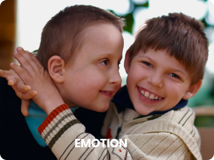
whole lot of emotion and humanism.
Our concept of the entire brand identity leans on
the idea of pivoting, while expanding the brand's
identity meaning to so much more than meets
the eye. It is an essential starting point for an
uninterrupted change, because Pivot Care is care
receivers central, a rock-solid pivot point that
enables them to enjoy a level of care that is
above the rest.
The most important part of the branding story is
that the patients are pivoting through new
changes without interruptions. Pivot Care
cherishes the patients' habits, happiness, and
security and intends to keep them the same.
That is why instead of stagnancy and the fear of
change, we are creating a world of care where
the changes won't be noticed, because it will feel
familiar, comfortable, empowering and
progressive, with a continuity, service reliability,
total transparency, and ultimate freedom of
choice.
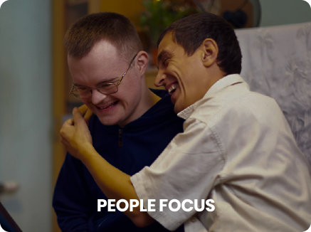
We are making people with special needs the central point that Pivot Care revolves around. It is the person that is the focus and that plays a main part in our story.
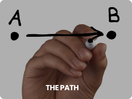
People are often afraid of changes and approach them with reserve, even when the changes are for the better. They often see a clear line of their path, from point A to point B, but it usually doesn’t happen. That is why we want to make Pivot Care path clearly visible, from point A to point B without any interruptions. You start, you get to the destination, and your mind is at ease.

Just as with change, a life plan often scares people. Again, we are presenting it as an easy task, where everything is clear, on point and exciting. Peace of mind is most crucial, and Pivot Care has it covered.

What is a star? It is an astronomical object that gives life and power, and it is a central object around which planets revolve. Does it sound familiar? The star is the pivot point, so we took that under consideration and used the star to mean: the people with special needs are Pivot Care bright shining stars; we revolve around them and exist because of them.
For the universal caring symbol, we used a hug. It has a big impact on peoples' lives, and speaks about Pivot Care care the most: we love you, think about you, and want the best for you.
Star as a celestial body around which everything revolves.
Person as a main focus of Pivot Care mission, representing person-centered care.
A clear, uninterrupted and continuous path to better care.
Going from stagnation to a progressive new life.
Bright, shining star as the people.
Hug as the universal symbol of love and care.
Pin as a go-to point for CCO and care providing.


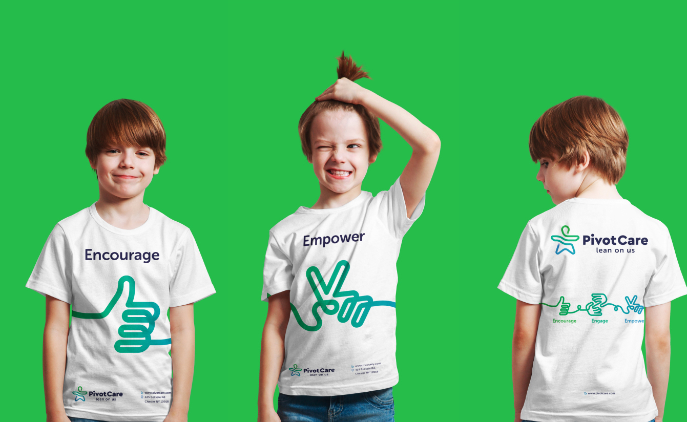
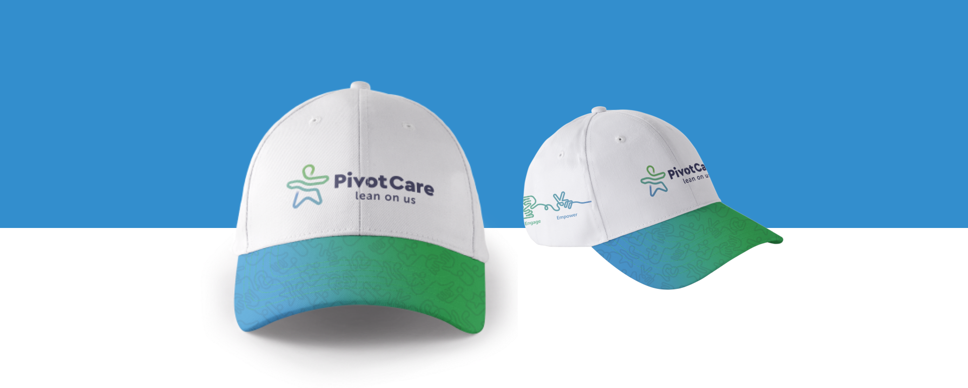
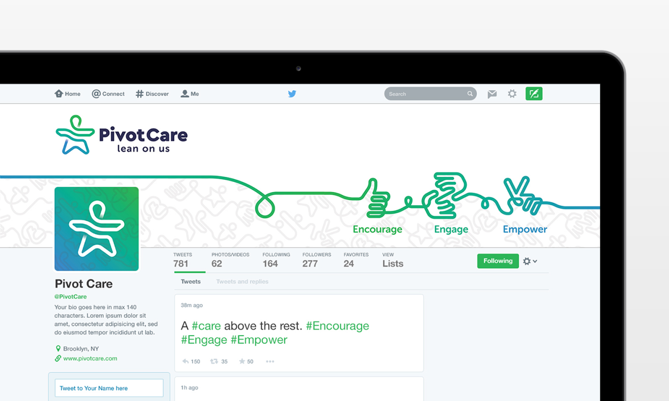
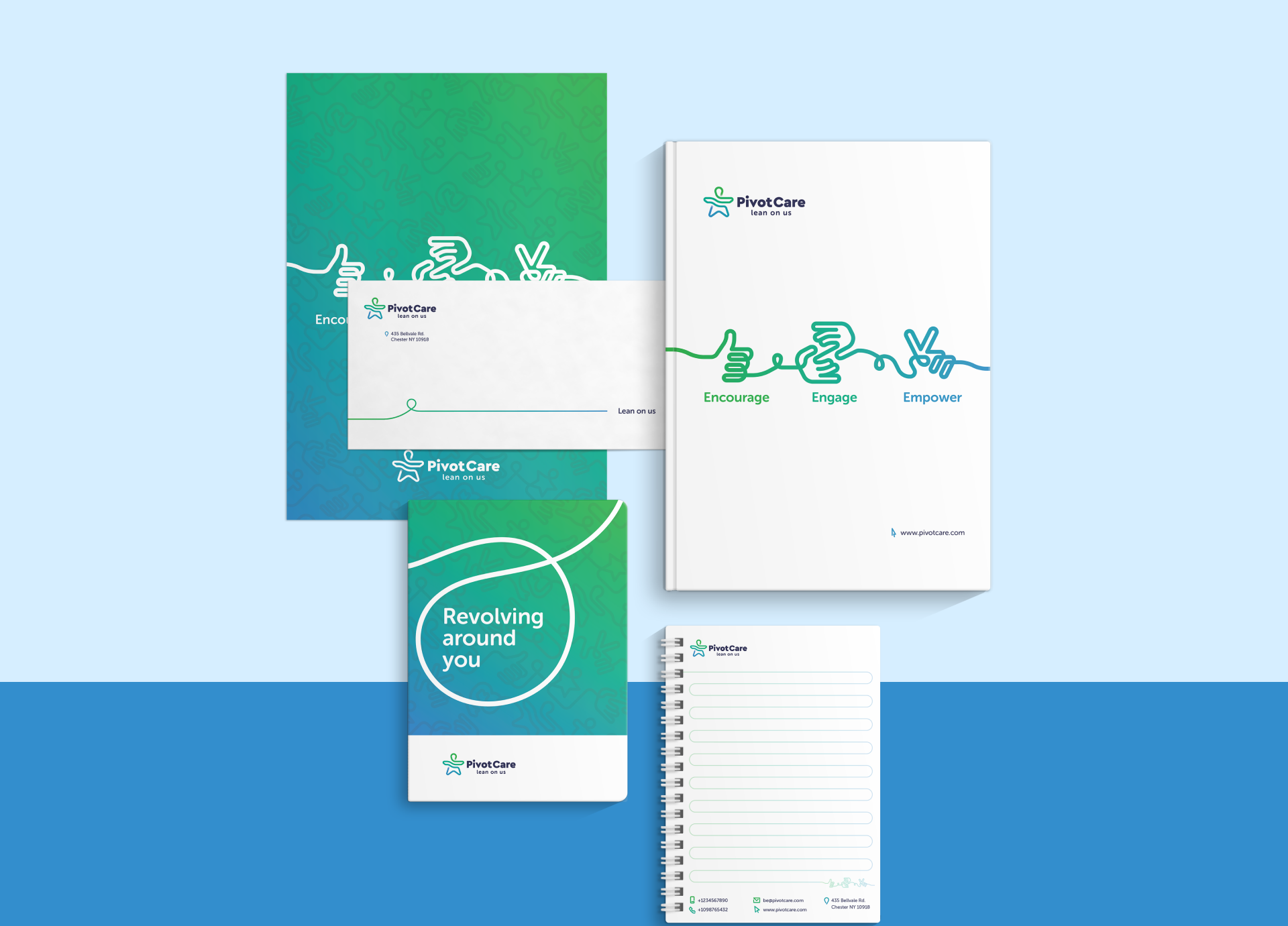
To create the pattern, we extended the
uninterrupted graphical path from the logo. It
works across all media and completes the
visual identity. It’s main purpose is to be a
unique, brand-identity element that works
seamlessly, from printed to web materials.


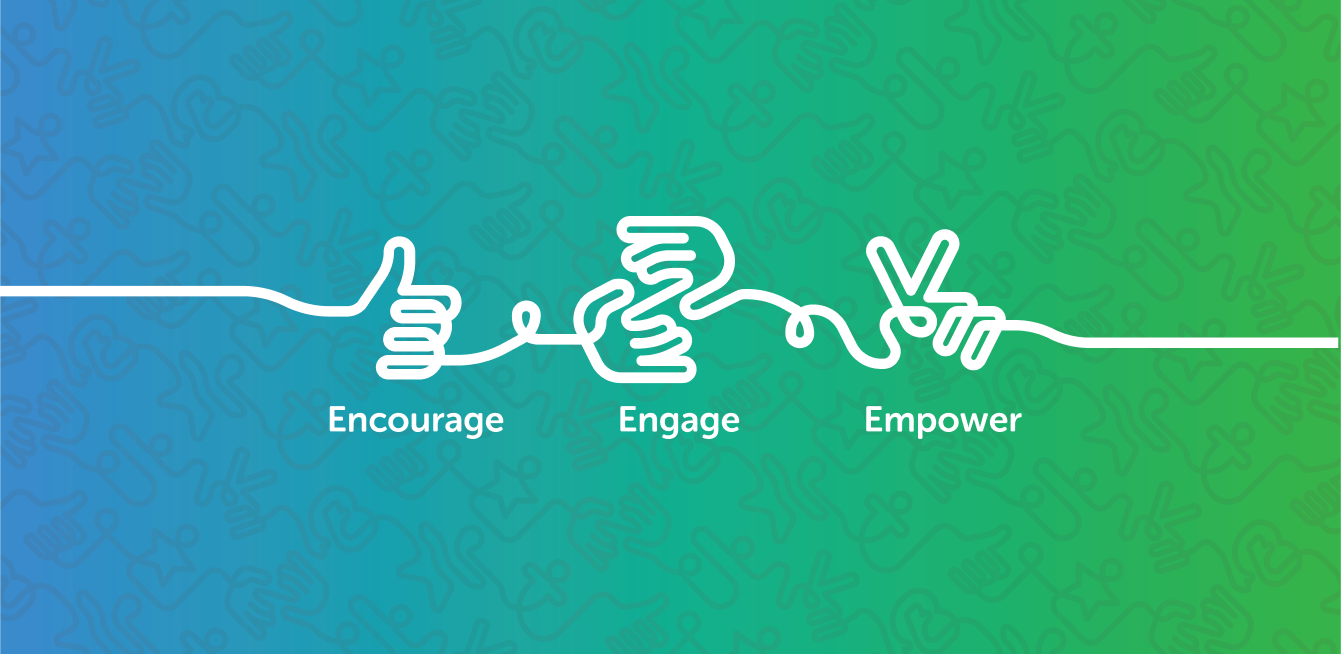
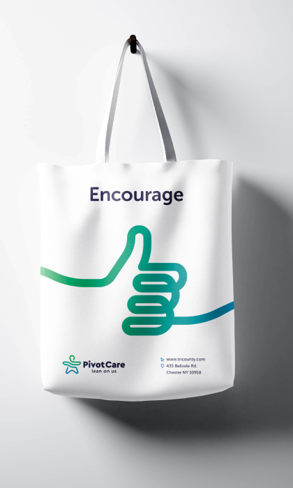
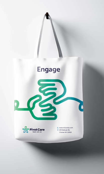
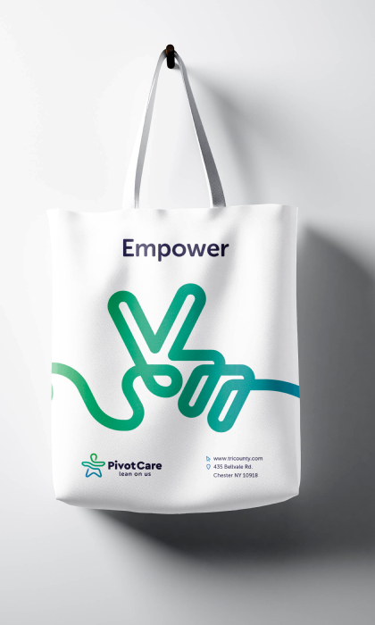
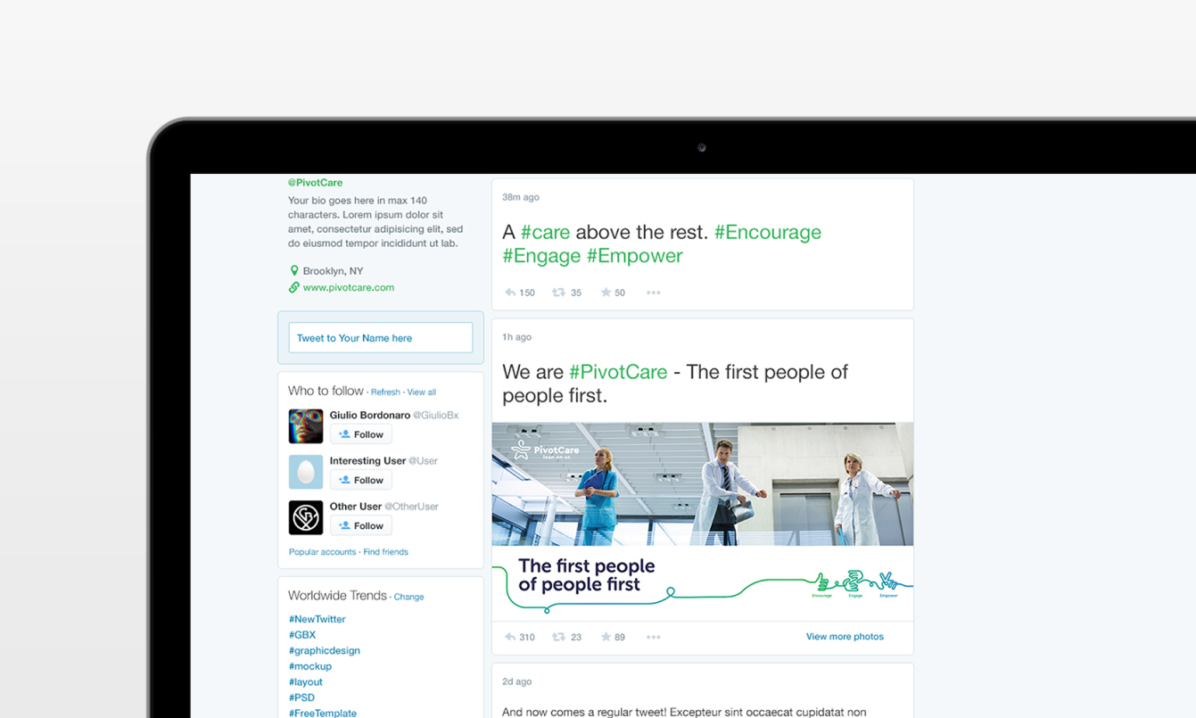
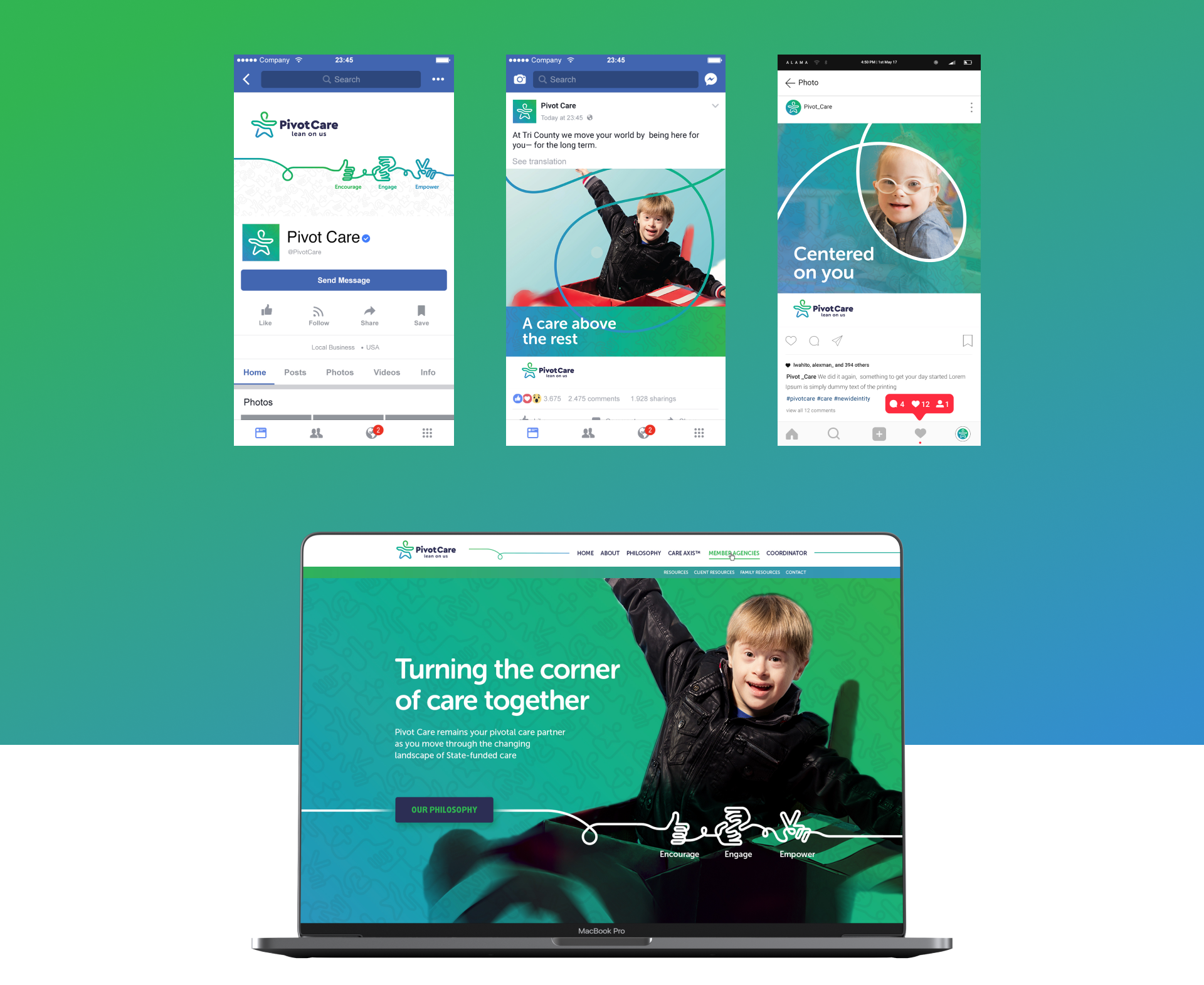
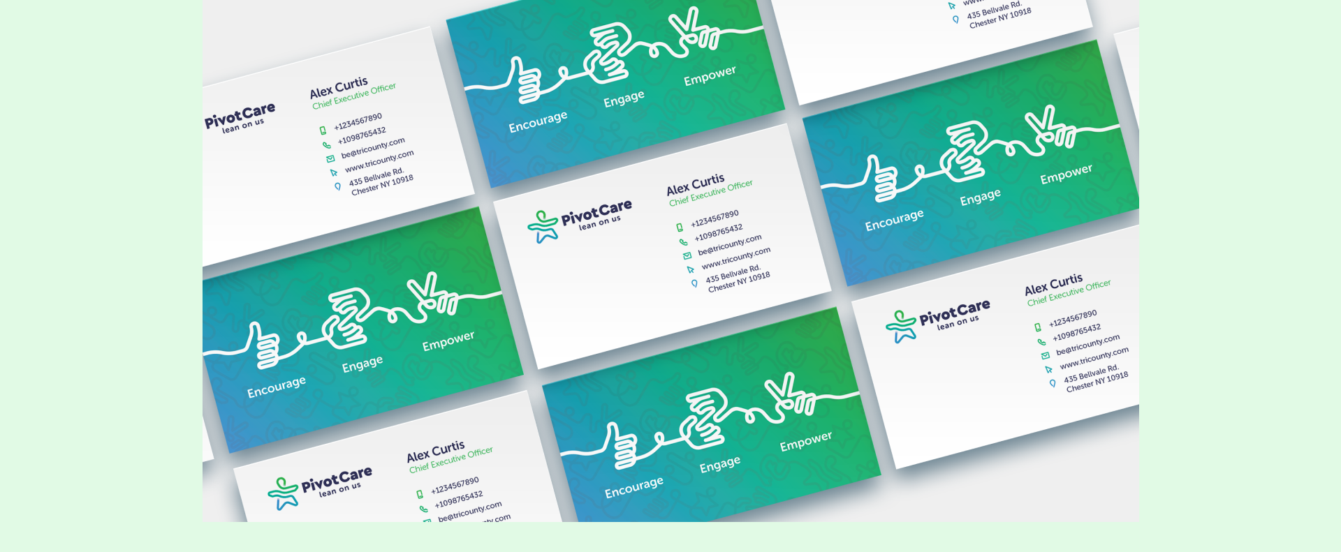
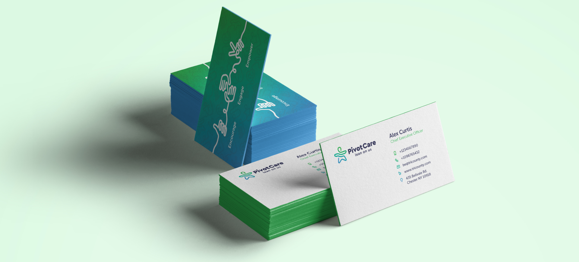
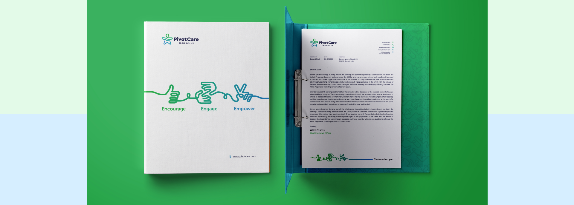
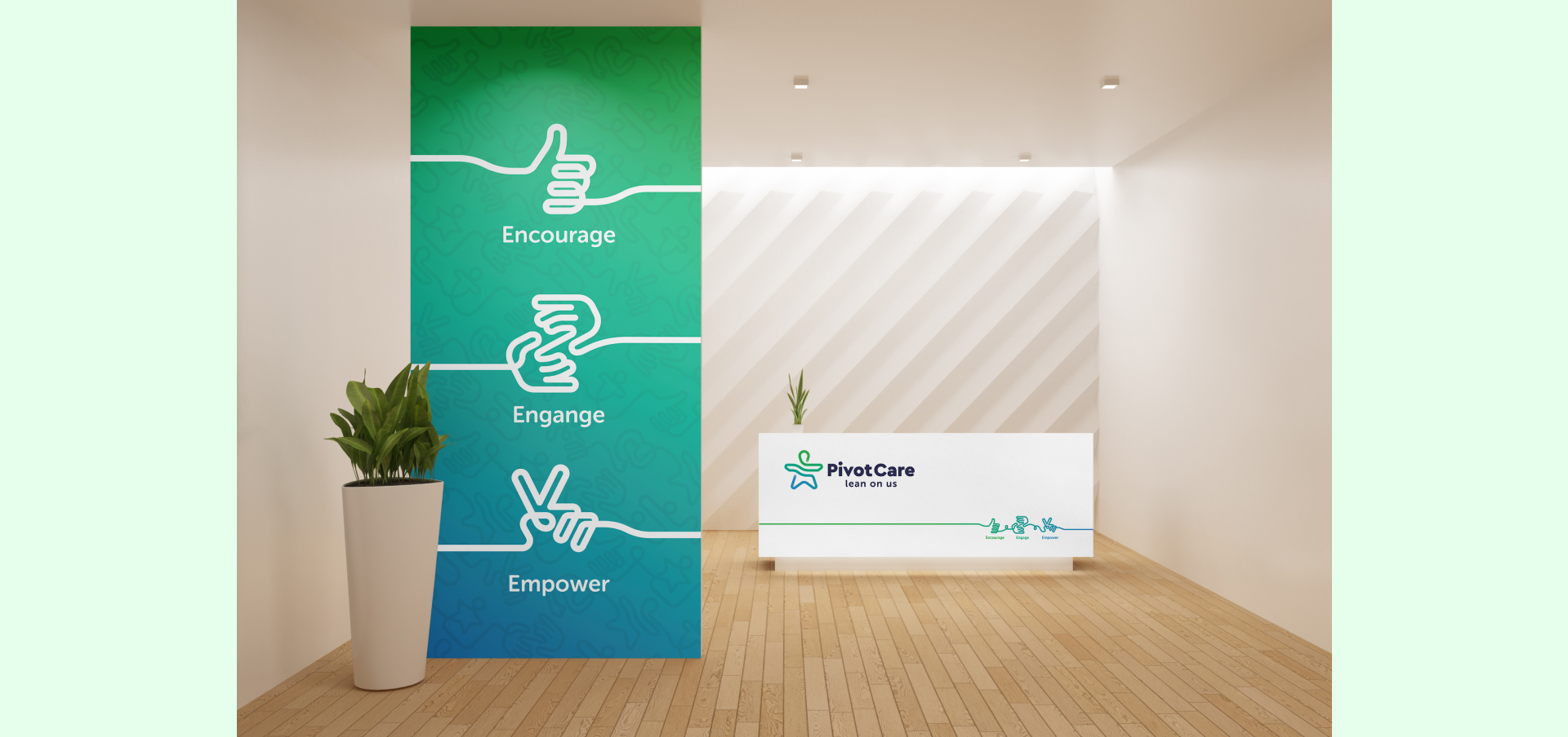
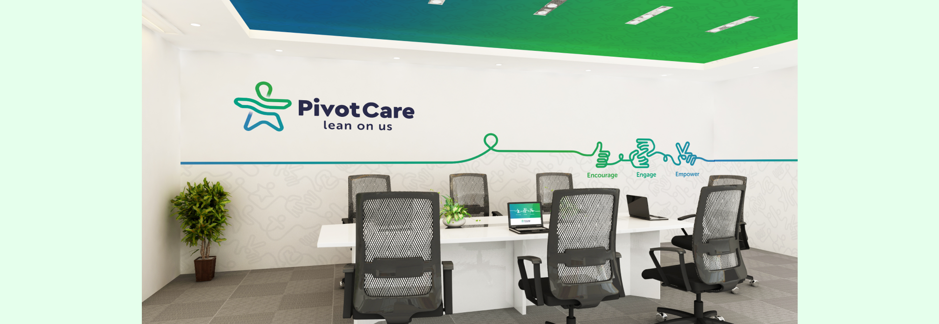
Our focus visual also acts like an extension of
the logo. Again, it is an uninterrupted
graphical path, but made out of unique icons,
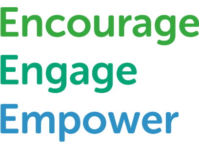
showing human hands that speak about the
core values of Pivot Care: Encourage. Engage.
Empower.